by Jan BoydPART 2 OF 2 Over the years I have had the opportunity to study with one of the world’s most renowned calligraphers, Sheila Waters. She teaches the following for layout in lettering which we can apply to our work with flowers, plants, etc. as well: All of this information can inform our understanding of the plants we paint – both the plants themselves and the understanding of beautiful proportions in the layout on our paintings. Using the Golden Mean and associated Fibonacci numbers, thereby avoiding even proportions both vertically and horizontally, will help to keep paintings from appearing static and dull. Fibonacci numbers can inform the numbers of foci in a painting – quantities of 1, 3 or 5 are generally perceived as more pleasing to the eye. Awareness of balance issues can help to avoid images that might appear out of proportion. So now it might be helpful to see these principals in practice by applying them to an Orchid painting I created a few years ago. I believe that it is in reasonable Golden Section proportions. In addition to the general layout, it is also interesting to note that there are 5 large leaves, 3 smaller Read More
Fibonacci and the Golden Ratio as Applied to Botanical Work
by Jan Boyd PART 1 OF 2 As artists, we often come across references to the related concepts of Fibonacci numbers and the Golden Mean. What do these terms mean, and are they useful in creating botanical artwork? These concepts are quantifiable, identifiable and fascinating. They can be identified in and related to the beauty we find in flowers, trees, fruit and vegetables, in paintings, in sculptures, in music, in poetry, in the human body and more. For this short article I will concentrate on how they can impact our botanical artwork in a meaningful way. For a more thorough presentation you can view my Youtube video. Beauty is said to be in the eye of the beholder, but in studying the beauty of nature, art and architecture, we can discern a common principle – the universal experience of pleasant proportion. This basic understanding of proportion has been recognized since antiquity and named by philosophers and mathematicians variously as the Golden Proportion, Golden Ratio, Golden Section or Golden Mean. All these terms (which can be used interchangeably) represent what can be reduced to a mathematical equation, which identifies and quantifies proportions that please the eye. In everyday life we use Read More
“Letters are Blooming” Calligraphy Demonstration and Book Gifting at the Westwood Public Library
If you were in Westwood last April (2023) you may have been fortunate enough to stop in and see our exhibit, “Hands Through Time” at the Westwood Public Library. True to our commitment to nurture learning, a lecture about the history of calligraphy, given by Diane Desautelle, was offered as the educational component that coordinated with the exhibit. Books on the topic of calligraphy and hand lettering were pulled from the library’s collection and put on display for the event. The Masscribes Board later discussed that some of their favorite books were not owned by the library and voted to give them as a gift. The Board chose: Written Letters by Jaclyn Svaren, Foundations of Calligraphy by Sheila Waters and The Art and Craft of Hand Lettering by Annie Cicale. Paula Howard volunteered to create handmade bookplates. In May of 2024, the books and bookplates were delivered to the library for processing. A date was set in August for an official presentation of the books accompanied by a calligraphy demonstration open to Westwood Public Library patrons. On the day of the Masscribes calligraphy demonstration, Paula Howard, Cathy Lauinger and Diane Desautelle arrived early to set up the Community Meeting Room, excited to Read More
Welcome to Ink Spots ~ The Masscribes Blog
Those of you who have been Masscribes members for some years will surely remember our beloved issues of Ink Spots, the printed and snail-mailed newsletter that would surprise us in our mailbox a few times a year. It regularly included a personal and encouraging letter from the president (The President’s Pen), a humorous or sentimental letter from the editor, announcements of upcoming events in the larger calligraphy world, reports from study groups, book reviews, exhibit reviews, workshop reviews, images of work from private shows to holiday greeting cards, articles about tools and supplies, and so much more. With the increased costs of printing and postage, along with limitations on our time, the newsletter went digital for a while and then seemed to take a vacation during the Covid-19 pandemic. We hope to someday again distribute a full-color printed publication that you can hold in your hands – but in the meantime, the idea of a blog within our already existing website seems to fit the bill. Here, not only can we share all the same informative and entertaining content, but it is also a wonderful way to have things archived so that you can return to the site and easily Read More
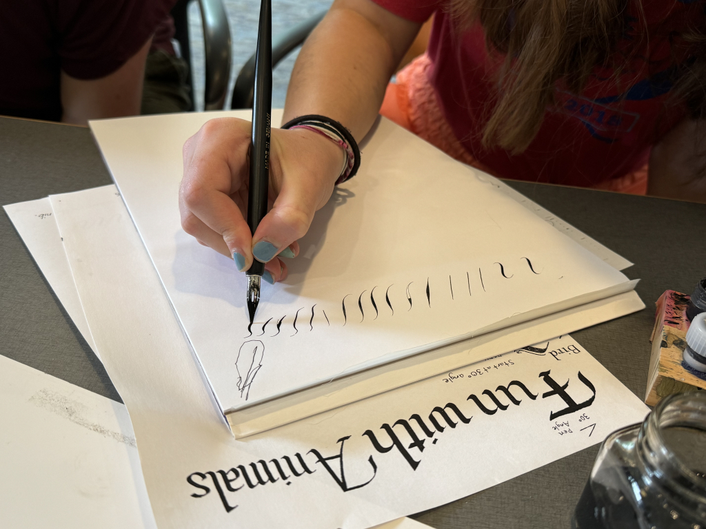
Tuesday Night Drop-in Calligraphy Art Group
For the past two years, members of Masscribes have been meeting via Zoom on Tuesday nights to create community, creative outlets, and beautiful pieces of art and calligraphy. We’ve had our regulars as well as many new faces over time. As the title says, there is no pressure to attend every session, you participate when you can. At first it was for us to gather and have company while we worked on whatever projects we had going in our home studios. Occasionally, we’ve had demos, including How to Fix Mistakes with Carole Roy, Creating Celtic Knotwork with Diane Desautelle and others. Illuminated letters were one project that we worked on over two sessions. Over the next few weeks, we worked on a project with modern calligraphy as well as projects using shapes such as circles and brush calligraphy exploration. In April ‘23 we had a joint project for our Exhibition at the Norwood Public Library. We all chose the same palette of colors and wrote out the title of the show, Hands Through Time. Look for updates on Instagram and Facebook on our Masscribes pages for images of projects by the Tuesday night group. The Drop-In meetings are a nice, casual Read More
Correcting Calligraphy Mistakes
There you are with a fresh, exciting calligraphy project in front of you. Mistakes are not the first thing on your mind, but now, while you are calm and hopeful, is a good time to prepare for them. I am a slow calligrapher and this is a slow method. Perhaps fast calligraphers don’t make mistakes (looking at you, Jane Rollins) but I don’t know about that, so I’ll give you what has worked for me. Anticipation is our friend. Use paper that is correctable (thick paper with sizing that prevents too much absorption, like BFK Rives or Arches Text Wove), and mediums like stick ink, gouache or paint that stay on the paper’s surface. How are your nibs? A new nib can be very enjoyable when you didn’t realize your old favorite had ragged edges. Have plenty of everything you’re using. (Yes, now is the time to check! Don’t ask me why I would emphasize that.) Fine paper has two sides; try writing on both sides with the correct size nibs and writing medium. Sometimes the “good” side with the watermark facing you won’t be your favorite. Now look at your workspace…is there one? Do you have a cat? Will Read More
The“Magnificent Monoline” Workshop – Review by Paula Howard
On the weekend spanning the 17th & 18th of September, 2022; the first in-person workshop since March of 2020 was offered by Masscribes – New England Calligraphy Organization. Nineteen participants engaged in the study of letters, alphabets, converted fonts and lines, led by one of our own members, Rick Paulus. Rick, recently relocated to the New England area from California, has perfected the practice of creating letters using various tools that have a consistent line width throughout the shape — or “monoline”. Although the letters didn’t have the thick and thin lines within the same letter commonly produced by calligraphers, this in no way lessened the enthusiasm and interest of the workshop participants. The fact that Rick has studied these forms extensively was really evident in his teaching style and sparked my excitement to add them to my calligraphy repertoire. A packed folder of 26 pages and a beautifully hand rendered name card were provided to each student by Rick. Art Deco, Vanitie Roman and Greyhound were just a few of the alphabets included in the handouts. Various treatments to the letters were also demonstrated on Day One,such as: drop shadowing, color blending, and outlining. Day Two found us back Read More